How We Built the Kup Doboj Website Concept
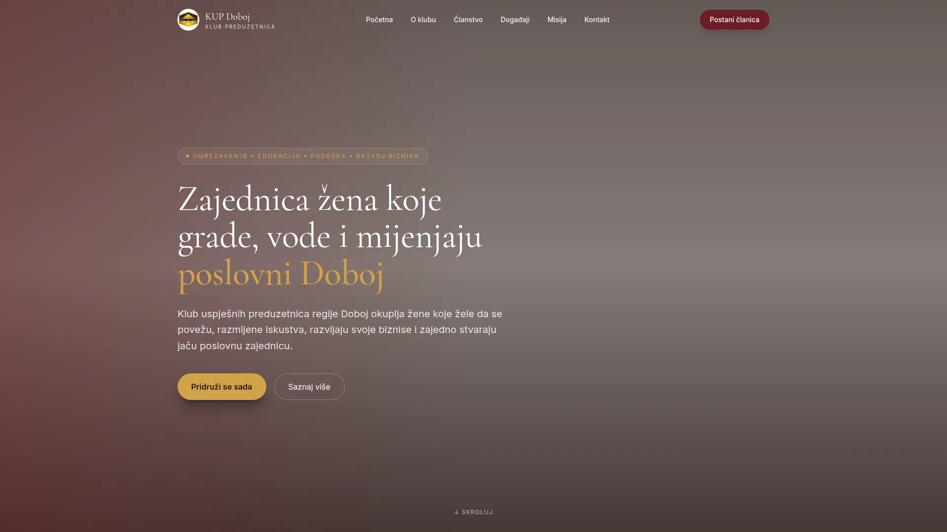
Kup Doboj is a modern local platform built to help people in the Doboj area browse, discover and engage with what's around them online. In this post we share how we approached the website concept — the goals, the structure and the decisions that shape the user experience.
Project overview
Kup Doboj is a community-focused local platform website. The goal of the site is to give a clear, modern online presence where users can quickly understand what the platform offers and how to interact with it. It's designed to feel native to a modern audience that expects fast, mobile-first websites.
Goal of the website
The main goal was to present Kup Doboj as a credible, modern platform that locals can actually use without friction. That meant a website that loads quickly, communicates its purpose in seconds, and gives visitors an obvious next step rather than a wall of information.
Design direction
We went with a clean, modern visual language — soft gradients, generous spacing and a calm color palette — so the content stays in focus. The intent was to feel approachable for a local audience while still looking like a serious, professional platform.
Mobile experience
Most visitors to a local platform like this will arrive from a phone — usually via a link shared on social media or messaging. The mobile experience was treated as the primary canvas, not an afterthought.
Typography scales smoothly across phone widths, tap targets are sized for thumbs, and the menu collapses into a dark, readable panel that keeps the rest of the site's premium feel intact.
Structure and navigation
The navigation is intentionally simple. We grouped the content into a small number of clear sections so that new visitors aren't overwhelmed. Calls-to-action are consistent and visually distinct, and the page reads as a logical sequence — what the platform is, who it's for, and how to engage with it.
Each block has a single job — introduction, value, visual area, final call to action — and the visual rhythm helps users scan rather than read every line.
What we focused on
Three things drove the build: a strong first impression, a clear information hierarchy, and a layout that feels equally good on phones and desktops. The visual language — dark backgrounds, soft gradients, glass-style cards — was chosen to feel premium without distracting from the content.
Why local projects need a clear online presence
A polished website signals that the project is real, active and worth engaging with. For local or community-driven platforms, this is especially important — most users decide whether to trust a project within a few seconds of opening the page. A modern site removes friction and keeps the focus on the content rather than the wrapper around it.
Final thoughts
The Kup Doboj concept is a good example of how a focused, well-structured website can make a local platform feel modern and trustworthy without overcomplicating things. The goal was never to impress with visual tricks, but to make the platform easy to understand and easy to use.
You can view the live concept here: kupdoboj.lovable.app.
Want a website like this for your business?
Evorian AI designs and builds premium websites for local businesses and service providers. Let's discuss your project.